
http://www-pcd.stanford.edu/mogens/378/final.html
``Intertwingularity is not generally acknowledged - people keep pretending they can make things deeply hierarchical, categorizable and sequential when they can't. Everything is deeply intertwingled.''
Ted Nelson: Dream Machines
In hypertext we can not only visit a text twice, we can visit in from different contexts. This means that following links through nodes affect our understanding of a text. How we follow the nodes and how we choose between alternatives therefore becomes important in understanding how we read a text.
Hypertext comes in many different forms but the accepted definitions include
Constructing meanings from hypertext can therefore be seen as an attempt create a meaningful structure to the information. So how do we create meaning from text?
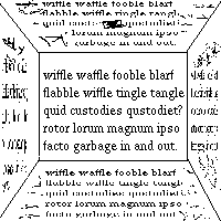
There was a glass on the table. Tom had a drink.
The implication here is that the glass in the first sentence is used in the second. We imply this information based on our common knowledge of what we use glasses for, and the fact that drinks are usually put in glasses and the juxtaposition of these two sentences implies a relationship between them. We imagine Tom, and his reaching for a glass (Does he fill it first? What is in the glass? That is up to the reader.) and having a drink. What happens afterwards is up to the readers imagination. The text never mentioned these things, but the reader used the text as a source for imagining a more complex, a richer description.
Once immersed in the flow of sentence thought, we are ready, after completing the thought of one sentence, to think out the `continuation,' also in the form of a sentence. ... But if by chance the following sentence has no tangible connection whatever with the sentence we have just thought through, there then comes a blockage in the stream of thought.
- Ingarden quoted in [Iser:p279].
This breakdown allows us to pause and reflect on our understanding before re-entering the flow of sentences. ``There is an active interweaving of anticipation and retrospection'' [Iser:p282]. Hypertext alters the flow by making us choose the next sentence rather than having it handed to us on a plate.
[McKnight2: Ch 3]: Linear texts are not necessarily read in a sequential order. [Apple], [Horn] are both examples of books keyed to both sequential and non-sequential readers. Keywords have inline references to other parts of the text, and layout is used to distinguish asides from the main topic. Font changes highlight key concepts and icons are used to flag concept categories. In these cases there is a resemblance to medieval glosses on latin texts or the Torah, where commentary and text intertwingle. In hypertext these little side notes might be implemented using small popup windows. However, this destroys the 'intertwingledness' of the text - the way that words in one version map onto another by being on the same page.
[McKnight2:p55] notes that people approach texts in many different ways with different goals and intentions. These differences affect the manner in which people read. For example, we usually read the TV-Guide in a non-linear fashion, but in different ways. Sometimes the goal is to read tonight's schedule, other times it is to find out when a particular Star Trek episode will be shown.
A book like [Apple] is geared towards access through cross-referencing and info-jumping. This ties in with the McKnight's admonition to consider the ways in which the user is likely to want to read the text. Publishers have created print conventions to help us read and recognize elements - headings indicate the start of major sections, columns help chunk information on a broadsheet, and so on. Hypertext needs to invent similar conventions, but new ones, since paper and screen are different media.
A paper page can be large and lightweight, as in the case of a newspaper, while a screen is small, heavy and has poor resolution in comparison. There is much evidence for different physical reactions to reading these media: screens slow down reading speed and tire the eyes faster than reading on paper. In some ways this works with hypermedia - hypermedia lends itself to short chunks of information that can be read and placed into a larger framework.
Paper has several intrinsic properties that give us meta information about the contents of a page: we can tell how used it is by the smudges and tears in the paper, we can easily see how a page is related to other pages, since all the pages are in partly view simultaneously. We see how old a book is by the color of its pages. The general appearance of the book conveys information to us. Most of these clues are lost or have to be artificially re-created in electronic hypertext.
Paper books have a consistent interface - reading one book involves almost exactly the same mechanical operations as another. This allows us to operationalize the mechanics of reading, and the breakdown of moving from page to page disappears, the crack papered over by the ever adapting mind.
Hypertext adds more choices to reading. The `next' page is not a simple operation any more but a more complex cognitive operation. The fact that we must choose in order to move on to the next sentence breaks the flow of `sentence thought'. We have to interrupt our reading task in order to make the choice. Obviously there is something to be said for blending navigation with reading, since it would reduce the breakdown. Since hypertext can also be dynamic (changing the text according to past behavior and history), a link traversal can be new every time it is made. On a first visit a page gives a simple overview, on a second visit it adds more explanation, and finally an animated sequence is added to the page. Choosing a link in this sort of environment becomes uncertain and difficult.
As mentioned in the introduction there are different kinds of links,
targets and selectors. Links are typed to indicate what it is linking
to. ![[Tree]](/gifs/stanford.tree.gif) could indicate
a link to environmental information.
could indicate
a link to environmental information.
Link targets are nodes of different kinds - or even parts of nodes. So a node could be a footnote, an authoritative critique or a poem. The node could be represented in different ways: a selection of a text or image, a small popup window or a complete hypermedia page in itself.
Selectors are the elements we manipulate in order to select a link
target. Selectors may map onto link targets (Click on the tree to see
more information about saving the wetlands) or link types
(![]() would indicate a popup
window) or some combination of the two, or neither. For example, link
words may be highlighted or they may not be indicated
at all, leaving the user to guess what words lead where. This last
type of navigation is very unobtrusive during reading, but becomes
very apparent when a new link has to be traversed. Since the link is
invisible the user must hunt and peck for the link. One reader states
that the text is read three times using this method: first for reading
the words, second for understanding and third for link discovery.
would indicate a popup
window) or some combination of the two, or neither. For example, link
words may be highlighted or they may not be indicated
at all, leaving the user to guess what words lead where. This last
type of navigation is very unobtrusive during reading, but becomes
very apparent when a new link has to be traversed. Since the link is
invisible the user must hunt and peck for the link. One reader states
that the text is read three times using this method: first for reading
the words, second for understanding and third for link discovery.
These things are the mechanical means of navigation - we construct larger structures using these basic tools. These systems are what the user must try to understand - understanding hypertext involves understanding the structure of the hypertext web.
If the user interface to the web is too complicated (it does not afford comprehension), the user will become frustrated and leave. When we violate the users expectations we heap another breakdown on top of the breakdown the user is in while trying to choose the next page. All the warnings about adaptive interfaces apply equally to hypertext as to menu option ordering.
[Ambron] contains a discussion of the Intermedia system. Intermedia contains a rich set of tools for navigating webs. Popup menus for link traversals (since a link could go to many places), different types of link (popups, jumps, sidebars). A link thus becomes a complex part of the interface, requiring many steps to activate in comparison with turning a book page or pressing a page down key.
On the other hand, keeping it simple so that each link has only one destination (like the web) means that the number of links multiply, and some compact representation of a link now has to be considered. Too many compact representations leads to icon-fatigue and confusion among the users. e.g. when a word is followed by six small icons signifying different links, text becomes harder to read.
Hypertext is an active, often visual, act. Navigation is often mouse based, where the user must position the cursor over a target area and press a button. This turns reading into a series of Fitts Law exercises. Reading can become a chore when small targets (link words or icons) are used. Accuracy becomes important, distracting from the main task at hand: reading and understanding the text. Frustration can quickly become overwhelming if the user interface is poor.
Textual interfaces leave the user having to page through links one by one or choosing a link to traverse from a list. This form of interface can be adequate but frustrating to use, since the link halfway across the page is always a pain to reach using only the keyboard. Lynx is an example of a text only browser in current use.
[Nielsen:p91] discusses command based browsers for hypertext in terms of databases. A command based hypertext places the highest burden on the reader, since formulating a correct command requires more engagement than selecting a menu item. Here there may not be much visual difference between link types, but they may still exist in the form of textual representations[Explain-1][Next].
Enter Command: _
Navigating hypertext is not as easily operationalized as navigating linear text since the structure of links on each page tends to be different. Readers end up having to create their own internal explanations for a web's structure. In the same way we create a virtual text using the unsaid text, I think we create a virtual map of the web using the implied cues of the links. [McKnight:pp183] cites studies showing how users tend to clutch to landmarks in the web as they explore the web and build their own internal map of the nodes. As webs become more complex and intertwingled, the taks of navigation becomes more and more complex. We need new tools to deal with these navigation problems.
Conventions help us build maps - paper books have conventions so ingrained we now don't realize they are there. A table of contents, followed by a preface, then some chapters, references, index and a glossary. The reader can easily recognize a novel, an ad and a scholarly article based almost completely on the layout and formatting of the text. These features become easily recognizable landmarks we can use to help us find our way in a text. While linear maps tend to be simple ("five pages past the tarantula picture"), hypertext maps need to be more complex to cope with hypertext's larger structure. A graphical representation of the web helps us build our own cognitive maps of the structure: "two links above the arachnid description." Of course, hypermedia ads and hypermedia scholarly articles will eventually evolve their own looks, further helping the reader build internal map structures.
[Oren] takes the idea of helping a user navigate a space to its logical conclusion. Guides in the interface tell the user where to go next. In addition the guides are part of the story, so the breakdown is not as severe as with normal text links. The interface is intermeshed with the content. Different types of links can be represented by using different guides. The use of actors in the interface takes the concept of 'a dialog with the text' to a new level. Oren points out that the agents can easily take over the interface, causing link selection and traversal to become a separate story. At the same time, having the characters do nothing makes them appear too flat and uninteresting.
One approach to avoiding the problem of overloading links and using separate icons for each link is to intertwingle navigation and text in a way similar to the intertwingling of latin and translated texts in the old illuminated manuscripts. In other words, the links and the text exist in separate and parallel threads.
-- --
-- --
-- --
and so the wicked princess flew out the window
--
--
and so the wicked princess flew out the window
-- --
while a bemused look crossed the young prince's face.
--
while a bemused look crossed the young prince's face.
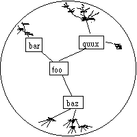
A fisheye view is a common way to present information in context. [Shafrir] points out that the problem of navigation metaphors is that they break down easily. Finding a suitable, obvious metaphor for navigation can be quite difficult. Shafrir and Nabkel use several ways to help the user build an internal map: icons are used consistently throughout the web, with information marked with an iconic representation. The list of topics leading to the node is listed, so the user can see what global context the node fits into outside of the route the node was reached by.
 Perhaps a visualization of the text space around the
current node would make it possible for the user to choose the next
node based on some fore-knowledge instead of using a navigation metaphor
based on road-signs, binoculars and maps. By using thumbnails or
keywords, the content of the link target could be displayed in such a
way that it does not interfere with the normal reading of text. One
possible example would be the InfoLens from Xerox. Here the text
outside the focus area is distorted and compressed in order to give
the reader a larger field-of-view.
Perhaps a visualization of the text space around the
current node would make it possible for the user to choose the next
node based on some fore-knowledge instead of using a navigation metaphor
based on road-signs, binoculars and maps. By using thumbnails or
keywords, the content of the link target could be displayed in such a
way that it does not interfere with the normal reading of text. One
possible example would be the InfoLens from Xerox. Here the text
outside the focus area is distorted and compressed in order to give
the reader a larger field-of-view.
Another view would be thumbnailing destinations outside the main text area - a variation on the visual cache mentioned in [Nielsen:p129] that projected potential destinations rather than history. This would allow the user to pick suitable destinations based on the look of the target.
 Finally, John Lamping et.al. from Xerox suggest the use of hyperbolic surfaces
for visualizing large hierarchies. All of these approaches give the
reader additional clues to constructing a map of the information
space.
Finally, John Lamping et.al. from Xerox suggest the use of hyperbolic surfaces
for visualizing large hierarchies. All of these approaches give the
reader additional clues to constructing a map of the information
space.
By animating movement through the web using the hyperbolic
surface in sync with the traversal of links, the user builds up a map
of the connected nodes and the relationships between them. The motion
of the nodes across the map helps the mind see the relationships
between the nodes. All of these systems support some kinds of reading
but not others - linear readers would probably prefer a guide to a
hyperbolic map.
[McKnight:p41] has a great illustration of Heidegger's readiness to hand as noted in Winograd and Flores and what happens when a breakdown occurs (Oops!).
(Reads text) Oh wow! (Reads text) So Soyenka was a revolutionary fighter. (Reads text) That could be sort of like, um, Tennyson. Tennyson was a dwarf, wasn't he? One of those writers was. I could compare him to Tennyson, with like, the physical situations that isolate them from society... (Click) Oops. Ok. I won't do that. I don't understand what's going on... Back this way. (Click) (Reads text).To summarize the analysis of what is described here: the subject is reading the information on screen, interpreting it and anticipating information based on past knowledge. Unfortunately the interface interferes and the reader is frustrated but recovers the previous state so that reading can continue from where it left off.
Note that this sort of simple repair can almost be operationalized because it is an error that we probably make frequently and we thus learn an automatic response to fix it. A higher level breakdown occurs when we traverse the 'wrong' link (i.e. the link leads to information different from our expectations). In this case we have to understand the material and realize that it is not what we were looking for. We then have to backtrack and hope we end up where we started (as McKnight notes, it is possible to 'go back' to a different node due to the dynamic nature of some hypertexts. He also notes that users find this very confusing).
The structure of information affects how we use it. [McKnight2] notes that visual maps and other visual indications of structure appear to afford use of the underlying material in tests. They also conclude that navigation appears to be an entrenched metaphor in hypertext that has now become nigh unavoidable. This fits very well with Heidegger's and Reddy's ideas on language as a tool to understanding, and the Whorf hypothesis that language shapes thought.
[McKnight:p31] Students create - rather than use - textbooks. Hypertext seems to fit better with the idea of constructed understanding forming from the illumination of a question from several different sources. By allowing students to choose their own path through material and to add links and commentary to it they not only create their own understanding of the text, but in the process create a new document for other students to read.
The authority of author is destroyed [Nielsen:p171], the reader is now the main shaper of the reading experience. The author is left to anticipate the reader and to plan interactions with the text. Authors choose where the reader can go, and may write the text to be read. However, the reader can also become an author by adding their own links and annotations to the text, further blurring the line. The author's role is redefined - the author shapes the world in which the reader `plays'.
On the internet, it is hard to draw a boundary around a web hypertext, since on-line papers may be included, images from remote sites are used and the text itself refers to texts stored outside of the local machine. The global hypertext has arrived. This makes things a lot harder...
Another thing to note is that all the authors call for more work in this area: perception and cognition within hypertext appear to have been treated lightly. See chapter 6 and 8 in [McKnight].
In some ways, [Bush] is still a visionary - the only system that even remotely resembles his is the now-defunct Lotus Agenda, which suffered from an ingenious idea and terrible execution. A system where your predefined categories would cause it to automatically associate items of data as they came in.
He was right that associations (links) would be important in organizing information. However, he could not foresee the importance of navigation tools to help the reader find her way through the book collection. As specified, it is a clear candidate for plenty of lost-in-hyperspace problems.
Understanding how we read hypertext involves understanding how we navigate hypertext. Navigation of hypertext is a problem on many levels - it forces the reader into breakdown, it can confuse or mislead the reader, link artifacts get in the way of the text, and so on. The virtues of hypertext - its associativity and linking - lead to its greatest problems.